How to Add Text and Titles in Alight Motion (Step-by-Step Guide for Beginners & Pro Tips)
Have you ever added text in your video but it still looked boring or unprofessional? You’re not alone. Many beginners struggle with Alight Motion because they don’t fully understand how to use text tools the right way. The result is simple text that fails to grab attention or match the style of the video.
The truth is, text is not just about writing words on the screen. It’s what makes your video clear, engaging, and visually appealing. A well-designed title can instantly hook viewers, while clean captions can keep them watching till the end. In this guide, you’ll learn exactly how to add text and titles in Alight Motion step by step. Not just that, you’ll also discover how to style, position, and animate your text so it actually looks professional. Even if you’re a complete beginner, this guide will make everything simple and easy to follow.
You may also check Alight Motion VS After Effects complete and detailed comparison.
Why Text and Titles Matter in Video Editing
Text and titles are not just extra elements in a video. They play a key role in how your content is understood and how people react to it. First, text helps increase engagement. When viewers see clear and attractive titles at the start of a video, they are more likely to keep watching. Moving text, captions, and highlighted words naturally grab attention, especially on platforms where users scroll quickly.
Second, text helps explain your message clearly. Sometimes visuals alone are not enough. Titles, subtitles, and captions make your content easier to understand, even for viewers who are watching without sound. This is especially important for tutorials, reels, and short videos.
Finally, text helps build your branding and style. When you use consistent fonts, colors, and text animations, your videos start to look more professional. Over time, people can recognize your content just by your text style, which strengthens your identity as a creator. In simple words, good text turns an average video into something clear, engaging, and memorable.
How to Add Text and Titles in Alight Motion ( Step by Step )
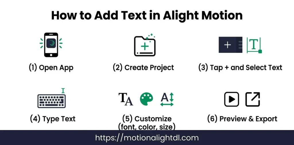
If you are new to Alight Motion, don’t worry. Adding text is simple once you follow the correct steps. Just go through each step carefully and you’ll be able to create clean and professional-looking text in your videos.
Open the App and Create a Project
Add a Text Layer
Type Your Text
Customize the Text
After adding your text, you can style it according to your video.
Try to keep everything simple and readable instead of overdesigning.
Position Your Text
Preview and Save
How to Create Professional Titles (Like YouTubers)
A good title is the first thing people notice in your video. If your title looks clean and strong, viewers are more likely to stay and watch. That’s why professional creators pay special attention to how their titles look. Start by using bold fonts. Bold text is easier to read, especially on mobile screens. It also gives your title a strong and confident look, which works well for most types of content. Next, try adding background shapes behind your text. A simple rectangle or box can make your title stand out clearly from the background. This is very useful when your video has bright or complex visuals.
Always use high contrast colors. For example, light text on a dark background or dark text on a light background. This makes sure your title is readable at a glance. Poor color contrast is one of the main reasons titles look unprofessional. Keep your titles short and clear. Long sentences are hard to read quickly. Try to use a few impactful words that directly explain what the video is about.
Finally, focus on timing. Your title should stay on screen long enough for viewers to read it comfortably. If it disappears too quickly, the message is lost. If it stays too long, it can feel slow. When you combine these simple techniques, your titles start to look clean, professional, and similar to what you see in high-quality YouTube videos.
How to Animate Text and Titles in Alight Motion
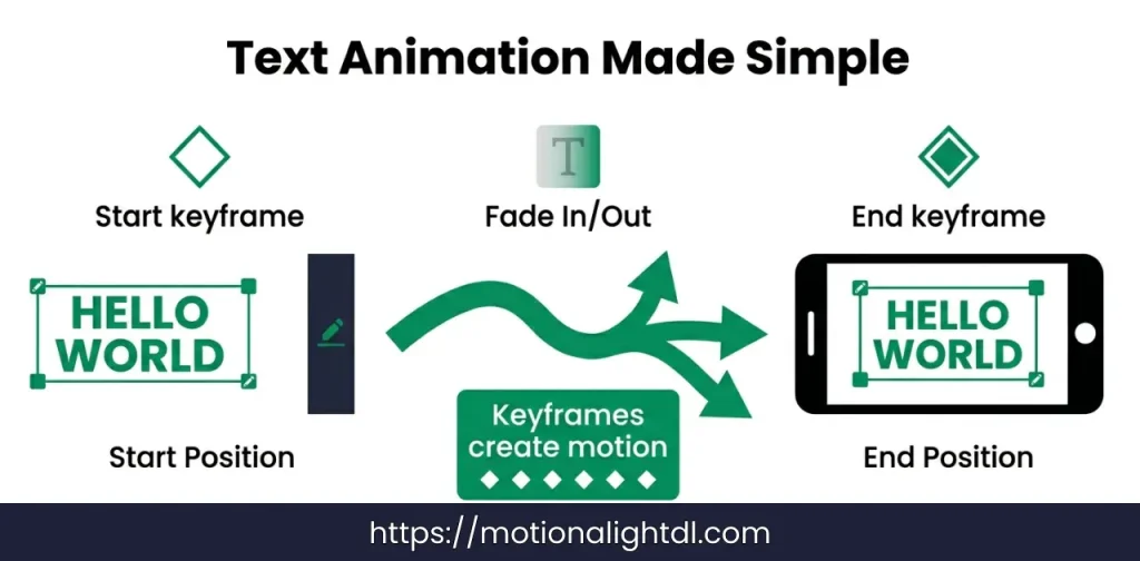
Animation is what makes your text feel alive. Instead of appearing suddenly, animated text moves smoothly on the screen, which looks more professional and keeps viewers engaged. The main concept behind text animation in Alight Motion is keyframes. You don’t need to overthink this. A keyframe simply tells the app where your text should be at a specific moment. When you add two or more keyframes, Alight Motion automatically creates movement between them.
For example, you can set one keyframe where the text starts off-screen and another where it ends up in the center. The app will animate the motion between these two points. Let’s create a simple animation to understand this better.
Slide-In Text
Fade-In Effect
Best Text Effects You Should Use
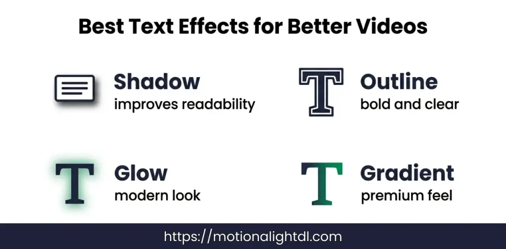
Text effects can completely change how your titles look. Even simple text can become eye-catching if you use the right effects in a balanced way.
One of the most useful effects is shadow. Adding a soft shadow behind your text helps separate it from the background. This improves readability, especially when your video has bright or busy visuals. Another important effect is outline. It adds a border around your text, making it look bold and clear. This is commonly used in YouTube videos where titles need to stand out instantly.
If you want a more stylish look, you can use the glow effect. Glow adds a soft light around the text, which gives it a modern and slightly cinematic feel. It works well for edits, reels, and creative videos. For a more premium look, try using gradient colors. Instead of a single color, gradients blend two or more colors smoothly. This makes your text look more polished and visually appealing.
The key is not to use all effects at once. Choose one or two that match your video style. Clean and balanced effects always look better than overdesigned text.
Best Fonts for Alight Motion (With Use Cases)
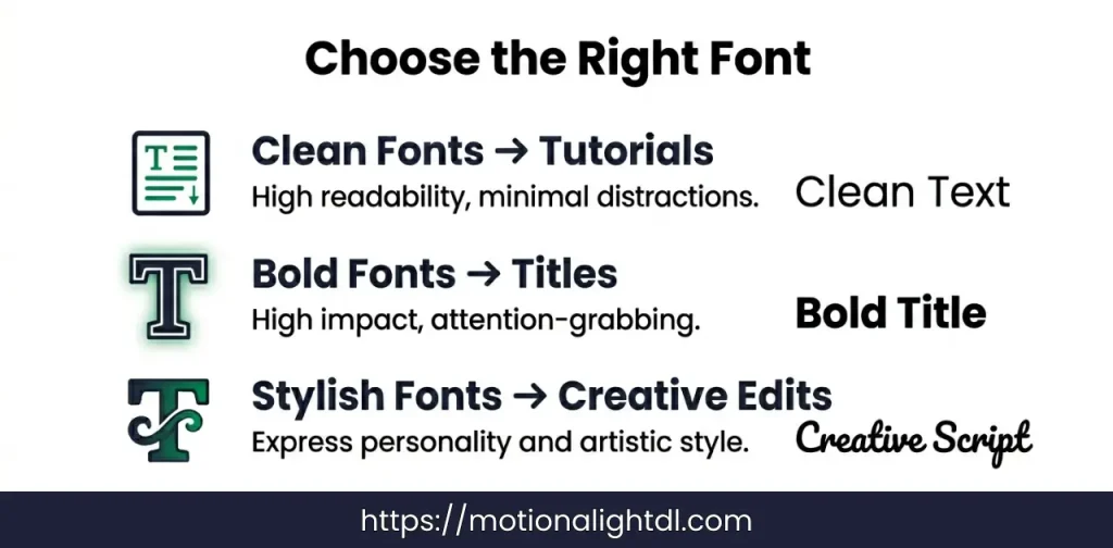
Choosing the right font can completely change how your text looks. Even with good animation and effects, a poor font choice can make your video feel unprofessional. That’s why it’s important to use fonts based on the type of content you are creating.
No matter which font you choose, readability should always come first. If viewers struggle to read your text, they will lose interest quickly. Always pick fonts that are clear, properly spaced, and easy to understand on mobile screens. A good font does not just look nice, it makes your content easier to watch and more professional.
Text Placement Guide (Very Important)
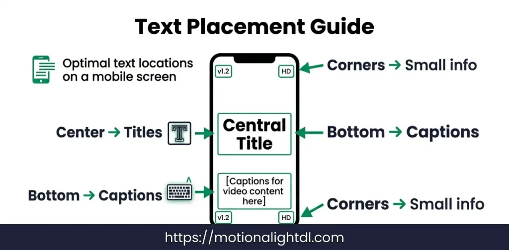
Where you place your text is just as important as how it looks. Even well-designed text can feel messy if it is placed in the wrong position. Good placement keeps your video clean and easy to understand.
Always try to avoid clutter. Too much text in one area makes your video look crowded and hard to follow. Give your text some space so it can breathe. At the same time, maintain visual balance. Make sure your text does not feel too heavy on one side of the screen. A balanced layout looks more professional and comfortable to watch. Simple placement decisions can make a big difference in how your final video looks and feels.
Real Use Cases
Understanding how text is used in real videos will help you apply everything you’ve learned in a practical way. Different types of content require different text styles, timing, and design.
YouTube Videos
TikTok / Instagram Reels
Gaming Edits
Aesthetic Videos
Beginner Mistakes to Avoid
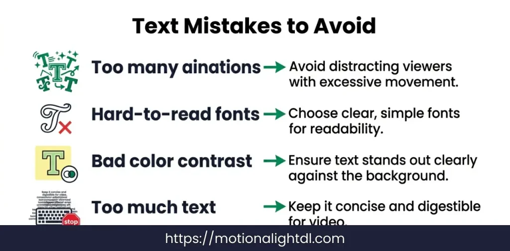
When you start using text in Alight Motion, it’s easy to make small mistakes that can affect the overall quality of your video. Avoiding these common errors will instantly make your content look cleaner and more professional.
If you focus on simplicity and clarity, your text will automatically look more polished and effective.
Pro Tips to Make Your Text Look Amazing
Conclusion
Adding text and titles in Alight Motion is simple once you understand the basics. From inserting a text layer to customizing fonts, colors, and animations, each step helps you create videos that look clean and professional. The key is to keep your text clear, well-placed, and easy to read so viewers can understand your message without any effort.
As you practice, try different styles, effects, and techniques to improve your editing skills. Focus on simplicity, avoid common mistakes, and apply the pro tips to make your text stand out. With time and consistency, you will be able to create engaging videos that not only look good but also leave a strong impact on your audience.