How to Add Text and Titles in Alight Motion Some Pro Tips for Beginners in 2026
You have just started using the alight motion and confused about “how to add text in your videos?” I can relate with your problem, not only you, a lot beginners find it difficult in the selection of the right text tool for their videos. It doesn’t matter for which social media platform you are creating content for such as YouTube, Instagram, Facebook, Tiktok OR any kind of advertisement video. If your text and visuals aren’t strong enough, then you will fail to grab the viewers attention.
Text and titles in alight motion plays a key role for delivering the message and making your videos professional. Many newbie mobile video editors think that video editing is just adding videos, music, effects and filters. But they fail in text and titles. They can’t deliver what viewers are craving for.
In this complete guide, we will learn about each and everything about the text and titles in alight motion. We will learn “text animation, adding text, text effects etc.” After this guide your next project will not be basic, it will be something professional and engaging.
Before heading to the actual content, first let’s see:
Why to Add text in Alight Motion?
You think your visuals in the videos are weak and they won’t engage your viewers? Don’t worry this can be solved by using text and titles in your videos. By adding text in your videos you can easily explain to your viewers what’s going on in the video. After adding these, the intent will be clear and understandable.
You can add headings, captions, bold the text, lyrics, quotes and tutorials. Moreover, you can make your text more engaging and visually appealing by adding the text animation. In this way you can stick your viewers with your video from start to end.
Understanding Text Tools in Alight Motion
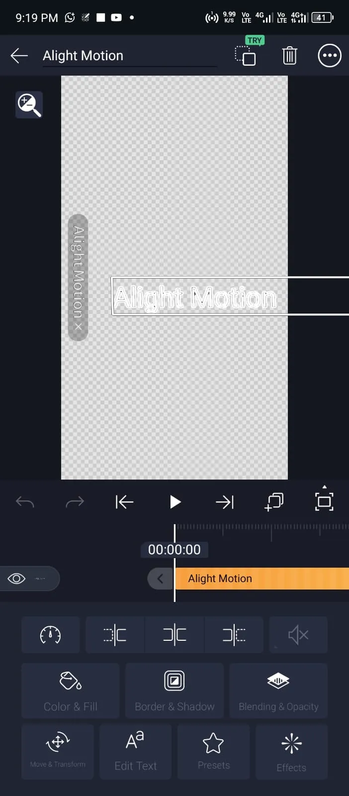
The text tools can be found in the toolbar of alight motion. There will be a small icon with a “T” logo. With the help of this tool, you can add various types of text in your videos like short title, heading, emojis etc. After adding text you can do various things such as changing fonts, letter & word spacing, text alignments, and text size.
These features will help you in designing your text and titles in alight motion. Suppose you are creating a video for a YouTube tutorial. You can do a lot of things, adding headings, step-by-step guides etc. This will help viewers to pick things / methods quickly.
You can also change the colors of your text from the colors. Not only solid color, you can also add gradients to your text which will make it modern and professional. This feature can be beneficial if you’re making kids content. Moreover, you can rotate text to make creative design in your videos. Change the text opacity, add multiple text layers in a single project.
How to add text in alight motion?
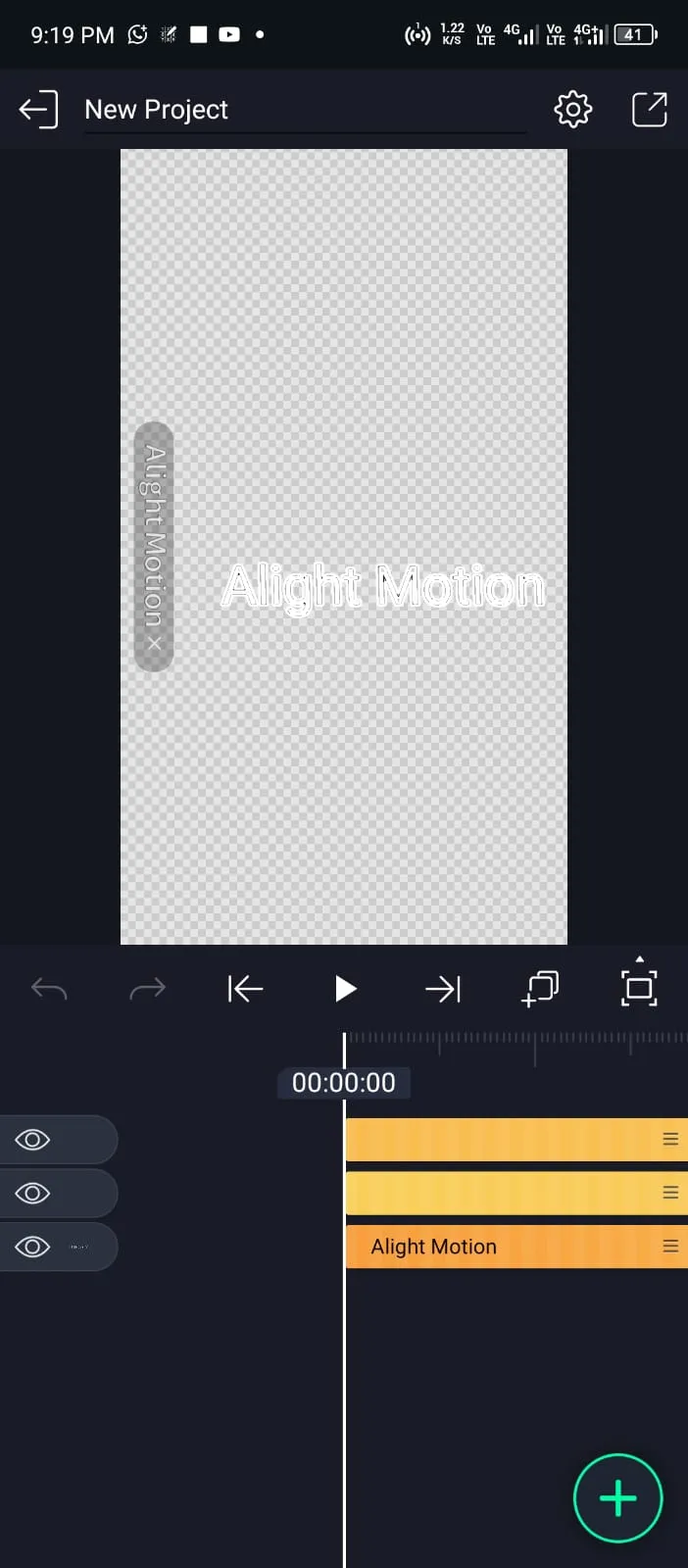
Adding text and titles in alight motion is a simple process. Add text using the toolbar, change fonts, colors, styles and positions etc.
Open Alight Motion & Project
Import your media
Adding Text & Titles in Alight Motion
Customizing text
Preview and Export
Making Professional Titles for Videos
After the visuals of your videos, text and titles play a key role. This decides whether the viewer will stay longer OR skip in the starting of the video. Learning text and titles in a light motion is an important thing to make professional projects.
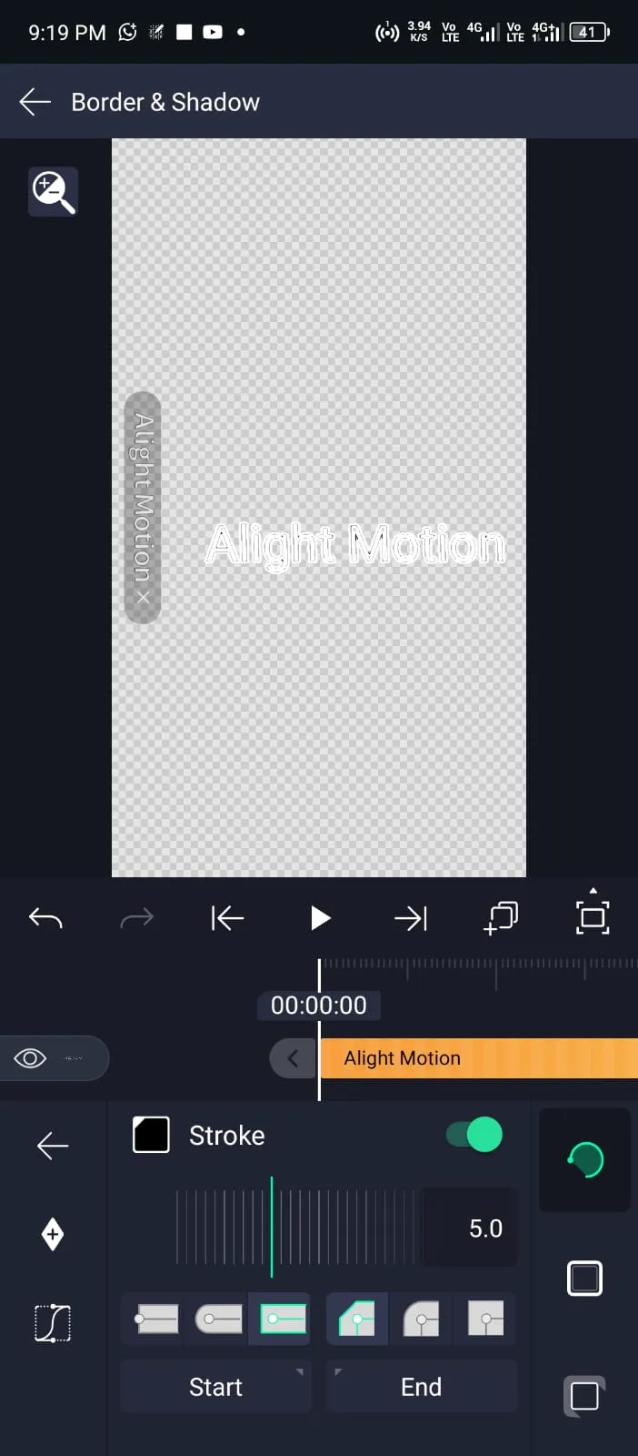
Simply add the text layer in alight motion to create titles. Then you can customize it in your own way. But pro editors use the Bold fonts and bright colors. Because they are easier to read and understand. You can also add the various shapes behind your text to make them visually appealing.
For example, you can use a rectangular shape behind your text. Another useful technique is the position of titles. Always keep them clean, bold and in the center. You can also play with the timing of your text, like when it will appear and how long it will stay on the screen?
Professional editors use a lot of various useful techniques with the titles like using animations, styles and effects. This makes your video more appealing and engaging than a video with simple titles.
Using Fonts to Improve Text Design
Same as text and titles which plays a key role in the visuals of video. Fonts play a key role in the text. It can entirely change the vibe of your videos. So, choose them wisely and according to the nature of your videos. If you are editing a tutorial video, then professional fonts will be useful. On the other hand if your project is about vlogging or comedy. Then creative and fun fonts will be ideal.
There are multiple in-built fonts available in the alight motion. If you are not satisfied with them, you can also import your custom fonts from the “Font” option.
How to Animate Text in Alight Motion for Catchy Visuals
Static text and titles in Alight Motion are not visually appealing than the dynamic ones. You can make your text dynamic by adding the various animations to it such as moving, fading in & out, and revealing etc. Follow these easy steps to create such creative effects to your fonts.
Styling Text before Animation
Extending the text duration
Duplicating the text layer
Applying Mask
Gradient and Opacity
How to Add effects and style to text?
Effects and styles are important for text and titles in alight motion. It helps to create professional and engaging text. Some of those effects and styles are mentioned below: